Jeep Badge of Honor is a mobile-first engagement platform designed to encourage off-road participation through progress, identity, and community. Currently, the app has over 20k ratings with an average rating of 4.8 and 22k active monthly users. It allows for brand engagement in the form of gamification and ordering hard badges to be displayed on one's vehicle. The tangible element of the experience connects to the real-life off-roading adventure and drives excitement among Jeep owners.
Jeep owners are highly engaged with off-road culture, but existing experiences didn’t clearly support long-term participation or make progress feel visible and motivating over time. The product was also built without an established design system in place, whicha made it look dated and chaotic.
For this project, my team implemented a design system that’s scalable, elegant, and accessible. Users should be able to engage with the product outdoors, often with limited attention, connectivity, and time.
Solution:
Design an experience that's simple, motivating, and reliable in outdoor and attention-limited contexts.
Create a clear direction for scaling the product.
Design a system that supports repeated engagement over time.
Minimize the design debt and introduce consistency between the visual elements.
Establish measurable KPIs and tracking mechanisms for ongoing iteration.
The primary goals of the product were to:
Support ongoing participation.
Help users understand their progress over time.
Build a sense of identity and recognition.
Reduce friction in discovering trails and tracking achievements.
Improve badge order completion rate.
Increase monthly active users and retention.
I worked on shaping the end-to-end product experience, with a focus on onboarding, discovery, progress tracking, and long-term participation. I also:
Built and maintained the new design system.
Partnered in a product trio model.
Helped define success metrics and instrumentation.
Contributed to roadmap prioritization through discovery.
%201.png)
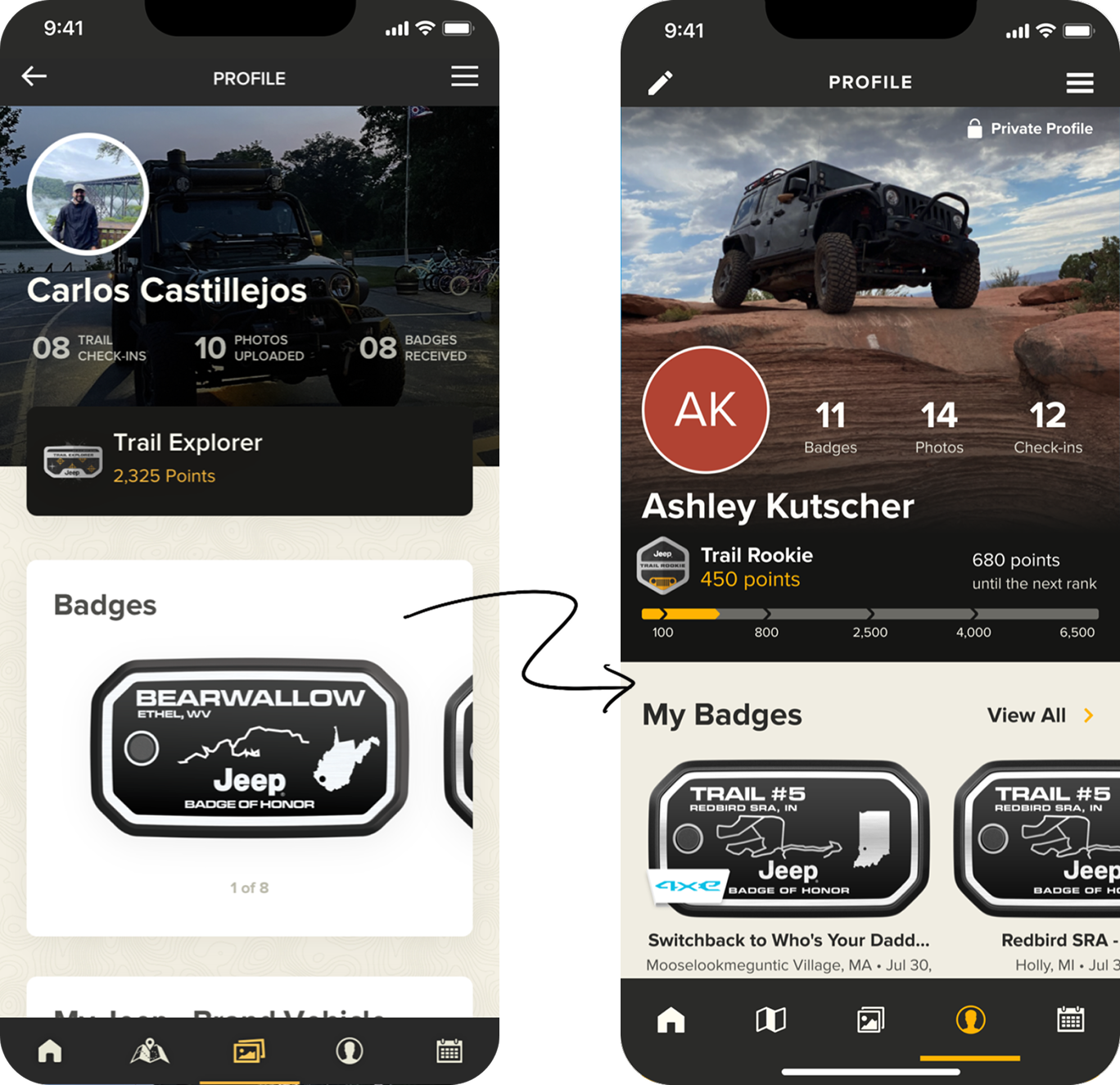
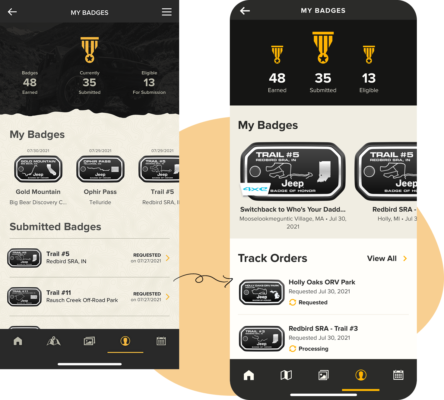
Profile & History
The profile acts as a personal record of participation.
It allows users to:
This screen supports long-term engagement and repeat visits. We introduced clear state-based visuals and grouping, which reduced confusion around rank progress and earning badges.
When I joined the Badge of Honor, the basis of the design system were established. I worked on redesigning pages and components by using the existing system elements and adding new ones. All stages of ideation required keeping design heuristics front of mind. On top of that, I focused on presenting the information needed for the user in a way that brings them the most value from perusing each page. Below are the main principles I was always mindful of during ideation.

I redesigned pages and components by auditing UI inconsistencies, mapping component redundancies, standardizing interaction patterns, and introducing scalable states. Each exploration process produced multiple versions that were validated through cross-functional critique, feasibility checks with engineering, and internal usability walkthroughs.
For high-impact flows (badge earning, onboarding), we conducted lightweight usability testing with participants recruited from Jeep community forums.
Key problem findings:
Confusion between “Check-in” and “Earn Badge”.
Lack of clarity in partial progress.
Uncertainty around physical vs. digital badge ordering.
This informed our renaming strategy and state-based redesign.
Instead of designing a linear journey, this product required a looped experience. This loop shaped how features and screens were structured across the app.

I tried to keep the flows simple with a touch of fun, without any overwhelming elements or steps, yet still allowing the users to accomplish tasks such as checking into the trails or ordering hard badges.
A big part of working on this project was its iterative environment and constant evolution. Throughout the time on the project, I worked on improvements such as:
Hard badge order reminder system.
Improving the badge request process.
Indigenous land information integration.
Reduced badge order steps from 5 → 3.
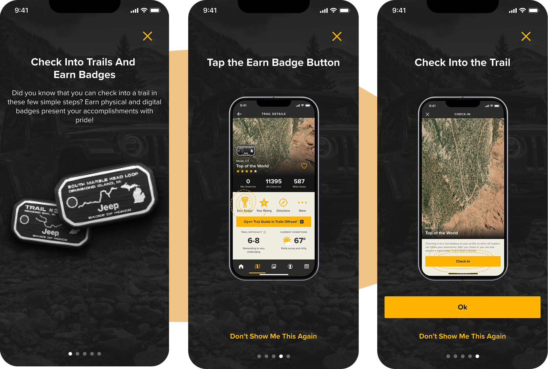
Badge Order Remider
The reminder experience reinforces the mental model around the purpose of the Badge of Honor and sets expectations early.
The focus was on:
Clear reminder was especially important for first-time users who were unfamiliar with the program.
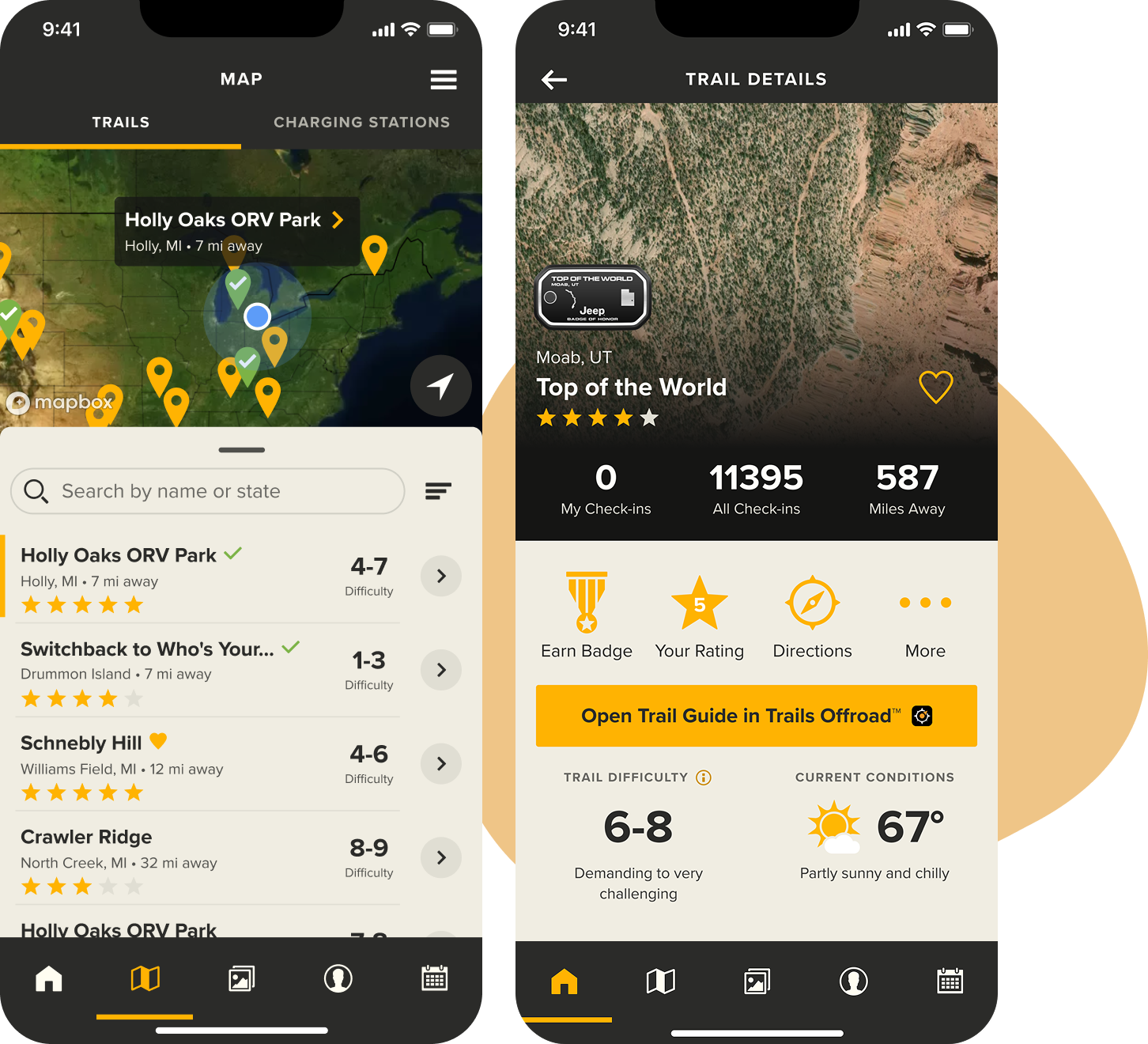
Discovery
Users can browse and discover trails in a way that supports exploration.
Design considerations included:
Discovery needed to feel inviting, not overwhelming.
Impact: Trail page engagement increased by 27%.
Progress & State-Based UX
Progress tracking is a core part of the experience.
I focused on:
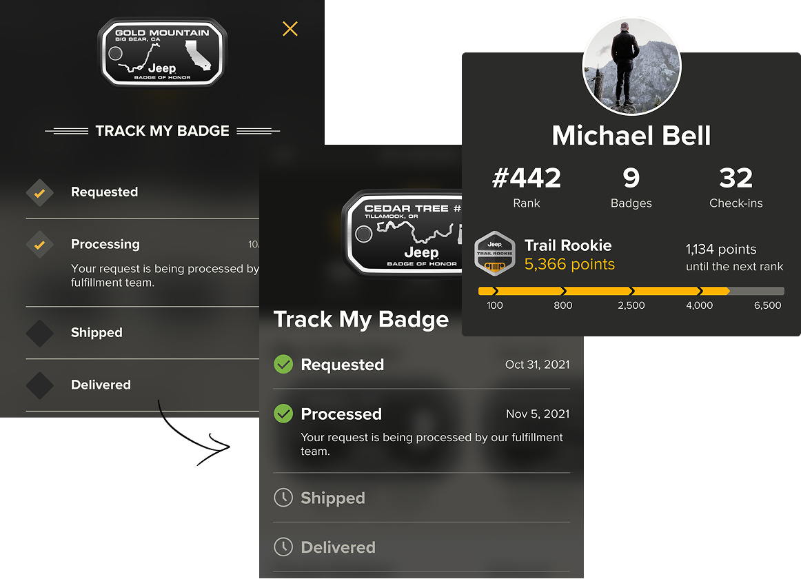
Completion & Recognition
One of the goals was to make it super easy for users to navigate the physical badge ordering process.
The experience emphasizes achievement, personal progress, and a sense of accomplishmnt.
Impact: 19% increase in completion rate, 40% reduction in flow abandonment.

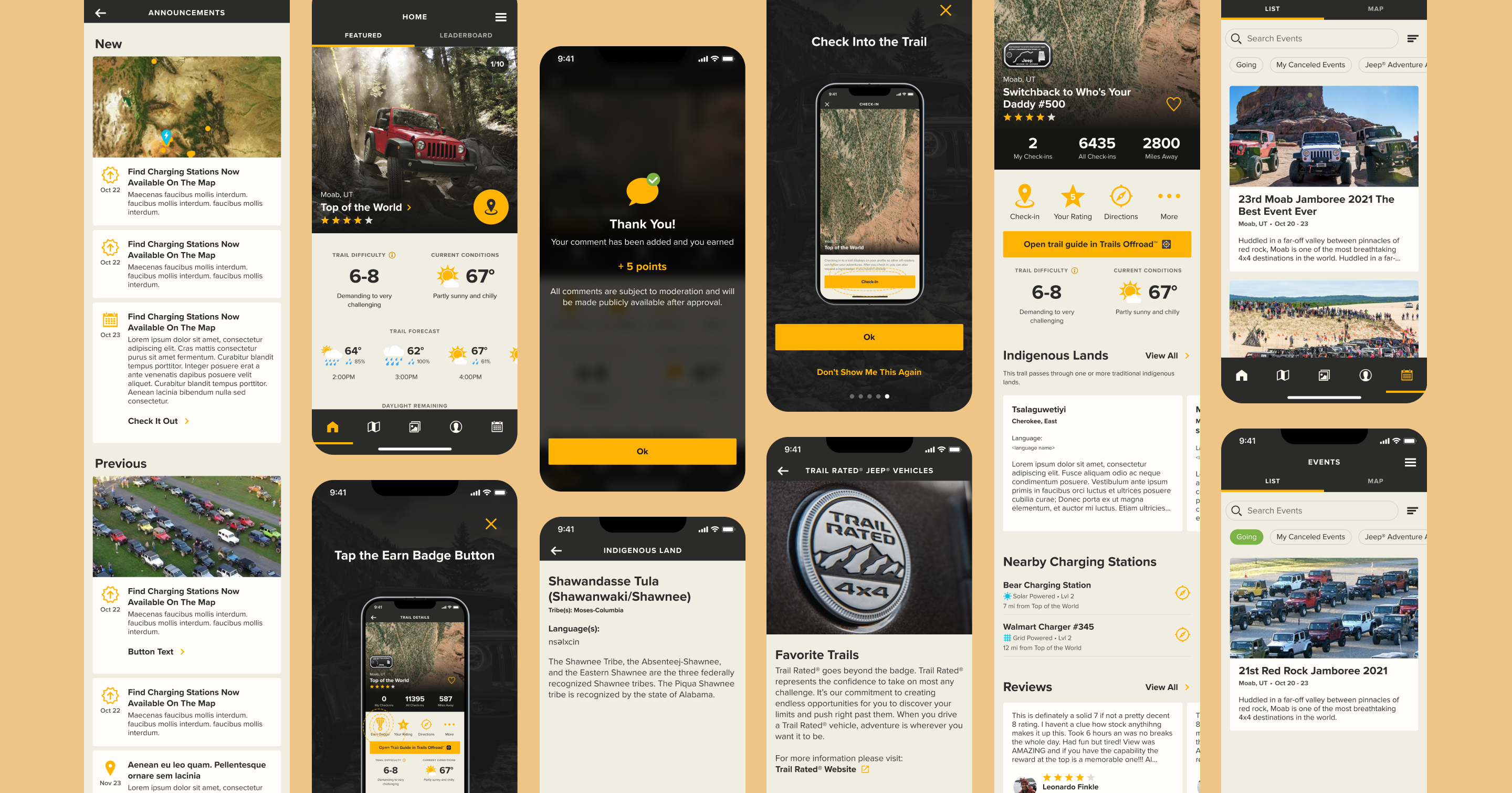
A chance to completely redesign the existing interface doesn’t come across very often, so it was a great opportunity to flex that creative muscle and get into the heads of the users of such an adventurous and fun brand. Below is a quick summary of a final impact:
Impact:
From 2021 → 2024, the product evolved measurably:
What would I do differently?
While we conducted lightweight usability testing and internal validation, I would advocate for:
Larger-scale moderated testing with active Jeep community members.
A/B testing on onboarding variations.
Offline-mode UX optimization testing in real trail conditions.
The final experience supports a non-transactional, long-term engagement model that encourages users to return, participate, and track their progress over time. This project was a great opportunity to flex creative muscle and get into the heads of the users of such an adventurous and fun brand, especially since the feedback for the new features was constantlybeing gathered from existing users.
This is one of my favorite projects that I've gotten to work on, as Jeep is such an iconic brand with exciting traditions. This project reflects my approach to product design: focusing on user behavior, system thinking, and experiences that evolve with continued use. It was a pleasure to help improve the experience for so many people in terms of enjoyability, cohesiveness, and information layout.